
UPDATE: Apparently my Gmail account is sending spam to several of you. Please do not open it unless there is a relevant current subject line and you are sure it is the real me sending the email.
I am so sorry for spamming you. I have taken several measures to ensure it does not continue. The one change you will notice is to leave a comment you will now have to have a Gmail or Open ID account. I am sorry to loose those of you who do not have these accounts, but I just can not go on spamming you guys.
If you continue to get spammy emails from me, please tell me. Without that, I have no idea I am sending out the nasties. And now onto our regularly scheduled blog post....
It took me about 30 seconds to join in with Leanne's Mod Pop QAL. I have never joined in a QAL before, mostly because they came at the wrong time for me personally. There are several I regret missing. This, however, I could not let pass.
You see, I want to make a quilt as a Christmas gift for a very special fella. I have been struggling with the idea of a man-quilt, as I am sure you all have at some point. That was until I saw this:
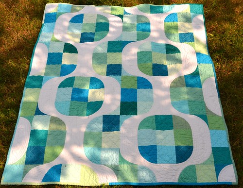 |
| Shamelessly stolen from Leanne of She Can Quilt |
This week's homework was to choose our fabrics. I've pulled a few that might work. Try to imagine the white in Leanne's quilt replaced with a Kona Ash in combination with this:

I took out the lighter colored fabrics at the top of the pile as they hurt my eyes when the sun came in the window. Maybe, being in Ireland, I am just not that used to the sun. Possibly. Anyway, here we are without the lighter fabrics:

I like that. Now what about just blues and purples? Now we are getting somewhere I think.

What do you guys think? Is there enough variety here? I tend to go for medium and darks leaving out the lights. But then, there will also be Kona Ash to brighten it up. Any hints are welcome!

Hi Cindy, that quilt is absolutely gorgeous. I too agree that it does suit a man! you know what I mean, it is hard trying to find a suitable man+quilt equation. I actually prefer the second to last pick, but hey what do I know. The bottom one is lovely too. :) x
ReplyDeleteI think I'd put a small amount of the green back. But it's your quilt!
ReplyDeleteIt's a great design, isn't it? I've been watching its progress from quilt, to testing, to publication with a great deal of interest but am not ready to sew curves yet!
I tend to agree with the others- I think a little sparkle of green (or hot pink?) would be how I would approach it! Although pink is not going to do it for a male! Good luck with your final decision!
ReplyDeleteI prefer the second selection.
ReplyDeleteI like the middle selection. I like those deep greeny colours in with the purples and blues. They give a bit of extra interest.
ReplyDeleteI have to agree... Put the green back and I am thinking the ash might be a bit too light for the background. I of course I am struggling just a touch with mine. I am posting later today.
ReplyDeleteGorgeous picks my dear, but honestly, put the greens back in! They look perfect.
ReplyDeleteI can't wait which bundle you will use. I love the pattern. It looks amazing but I am to scared of curves!
ReplyDeleteI think I would go with your first pick! I love those fresh greens you have in there. Whichever you go with wil look stunning.
ReplyDeleteYou know that you can start with that beautiful last stack and add a bit later if it seems that you need something more. I think that this is going to be a wonderful quilt.
ReplyDeleteI liked the first pick the best....the greens add a bit of sparkle...like the bubbles in champaign!
ReplyDeleteIt is going to be a beautiful quilt.
I'd go for the top half of the first pile, sorry ;)
ReplyDeleteOption #3 looks great to me! Isn't it handy having a fabric shop you can choose from :oD
ReplyDeleteSome great fabric choices there! I like the slightly darker shades without the green looks good. Not sure on those exact shades, maybe some darker greens would work better? =D
ReplyDeleteI quite liked the pile with the bright greens in it. Or maybe fuchsia pink ... but then not for a man, I suppose. Crumbs, wasn't I helpful? Not! :oD
ReplyDeleteI really like it with some green in there too!
ReplyDeleteI think I prefer it without the darker greens but I like Leanne's suggestion of using the final selection and then adding more if you need to!
ReplyDelete